Schenectady Pride
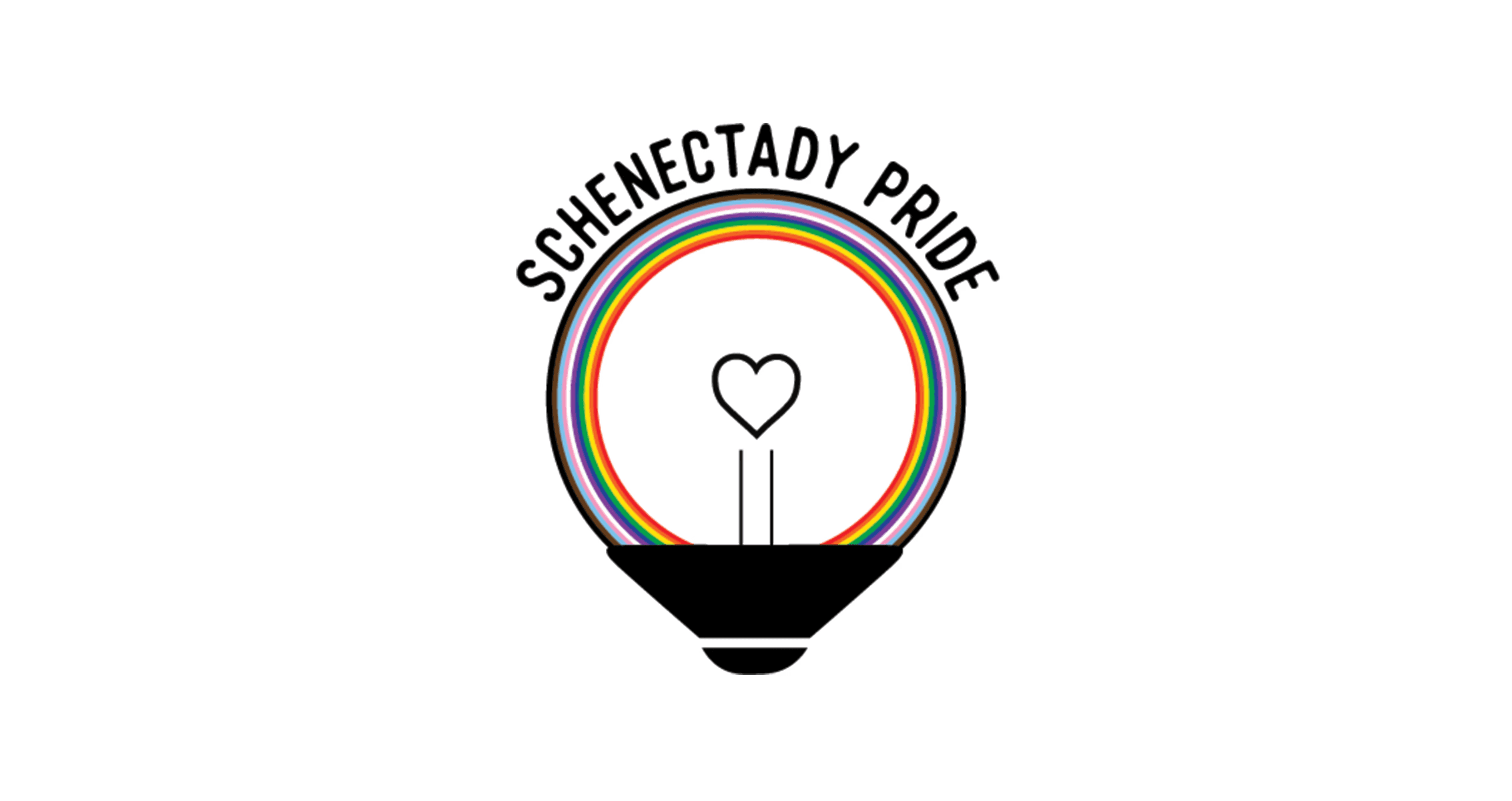
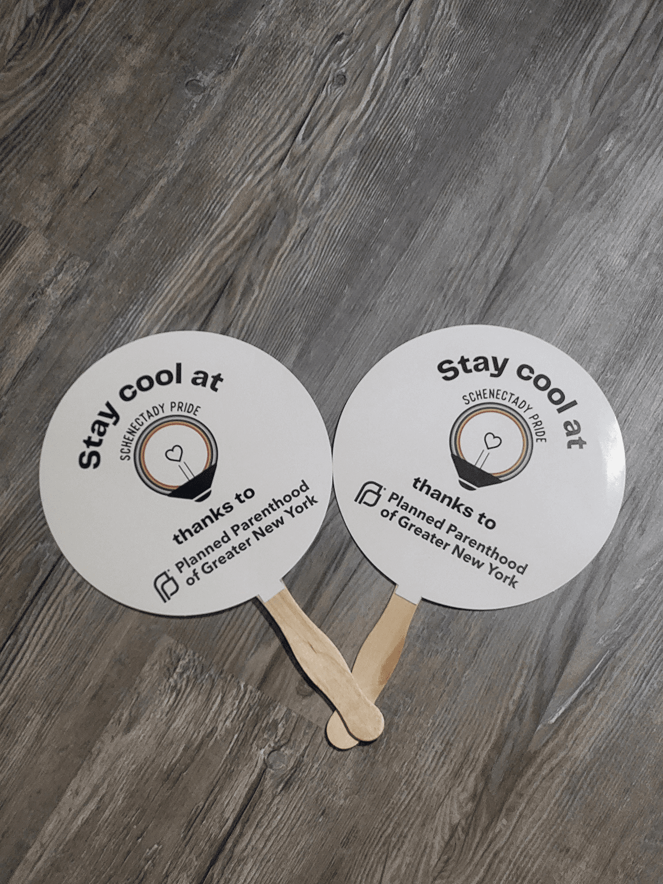
A logo celebrating Schenectady Pride’s 11th Festival.
.business
problem
Schenectady Pride needed a logo that felt meaningful and lasting, something that could represent both the LGBTQ+ community and the city’s identity. Their previous visuals lacked a strong, unified system and didn’t fully reflect their mission of inclusivity, pride, and community.
solution
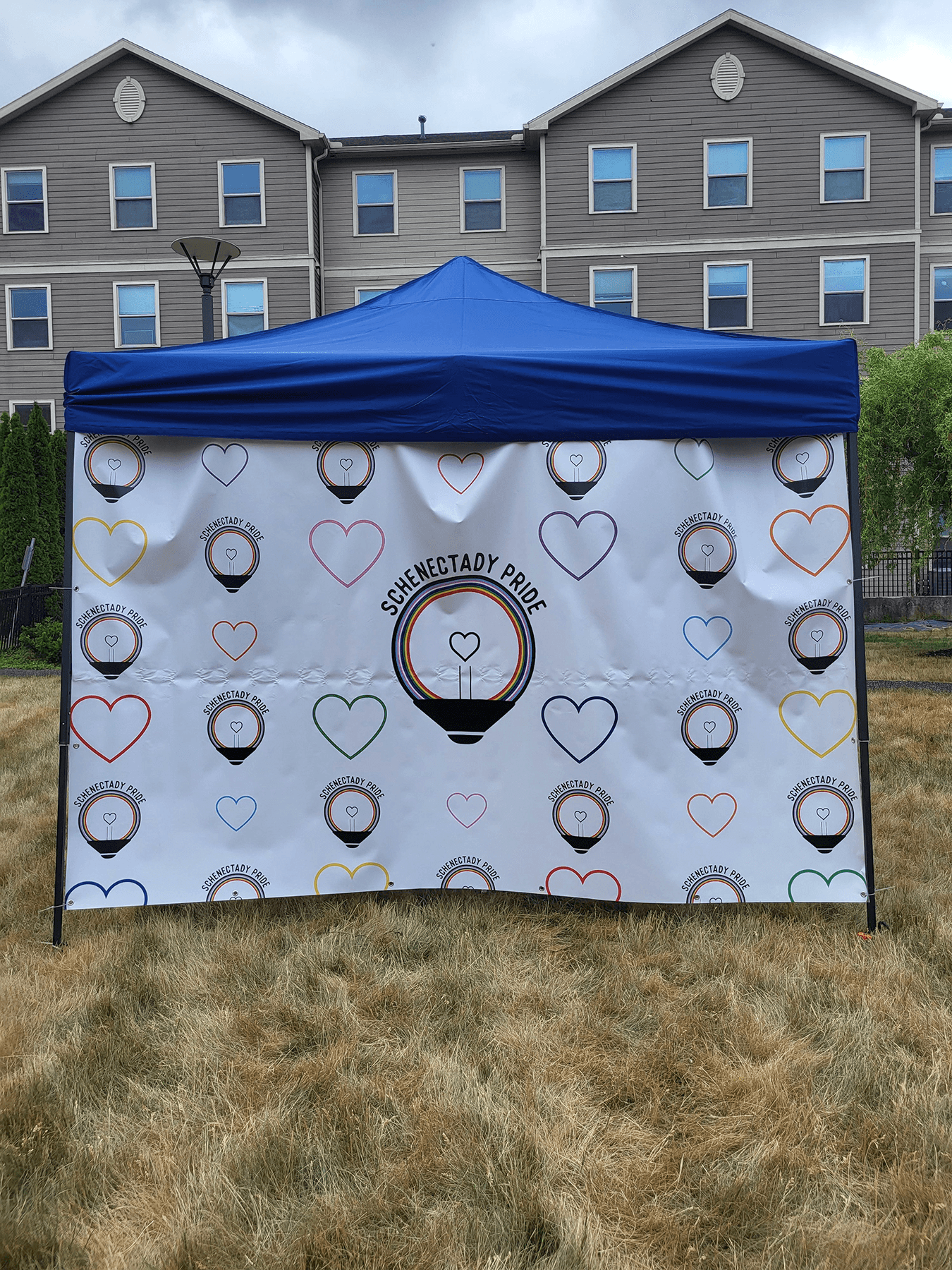
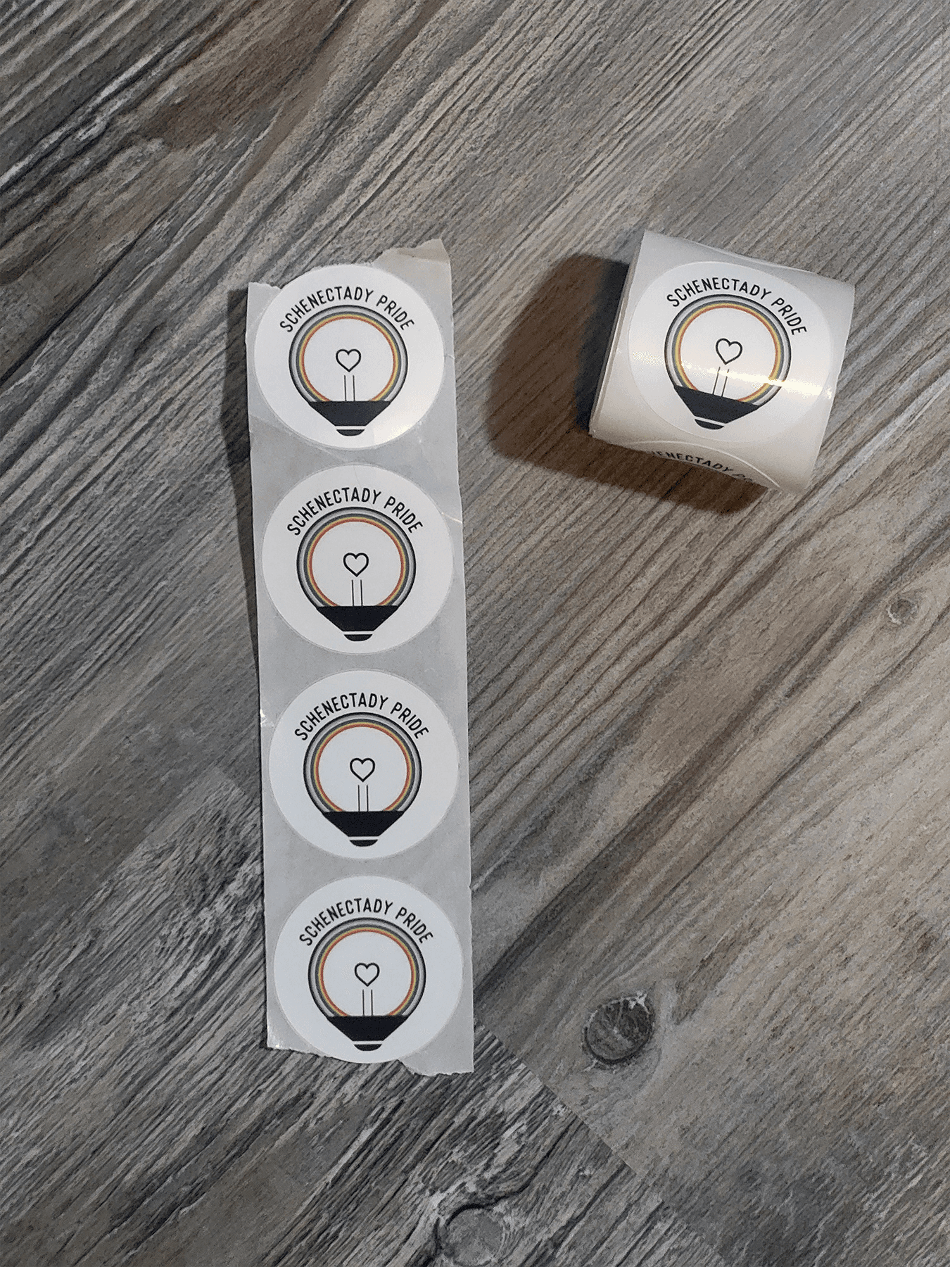
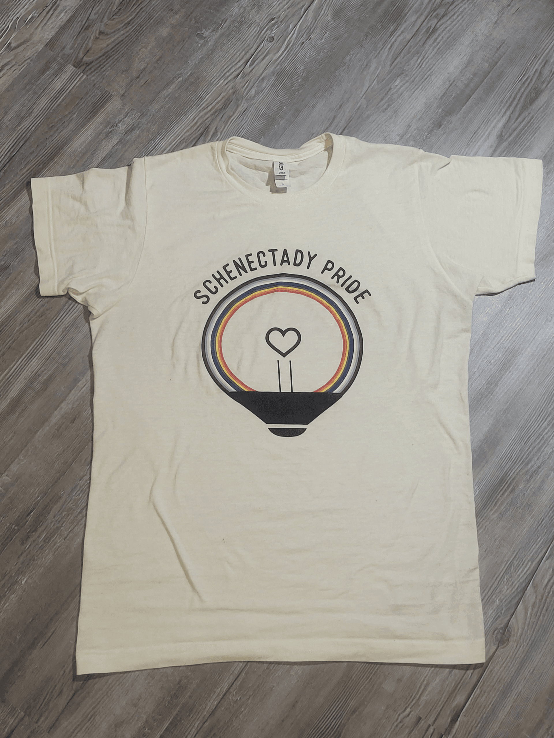
I created a clean, timeless logo that blends Pride symbolism with elements inspired by Schenectady’s history. The design system was built to be flexible and recognizable across print, digital, and event materials, ensuring consistency while celebrating identity and unity.
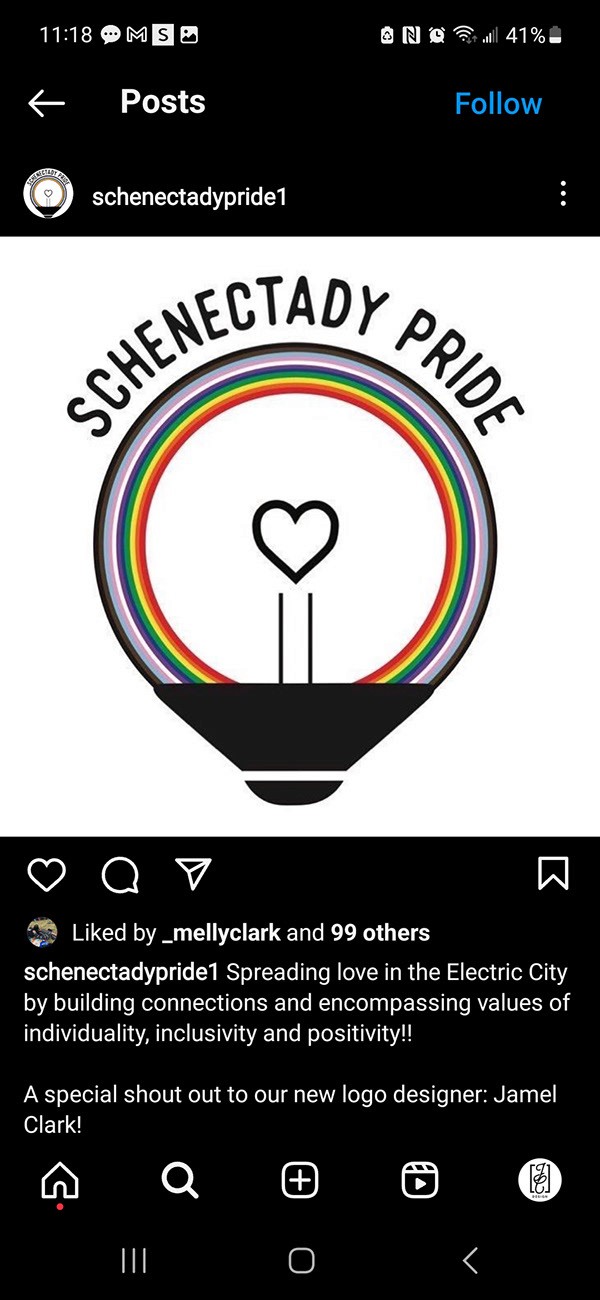
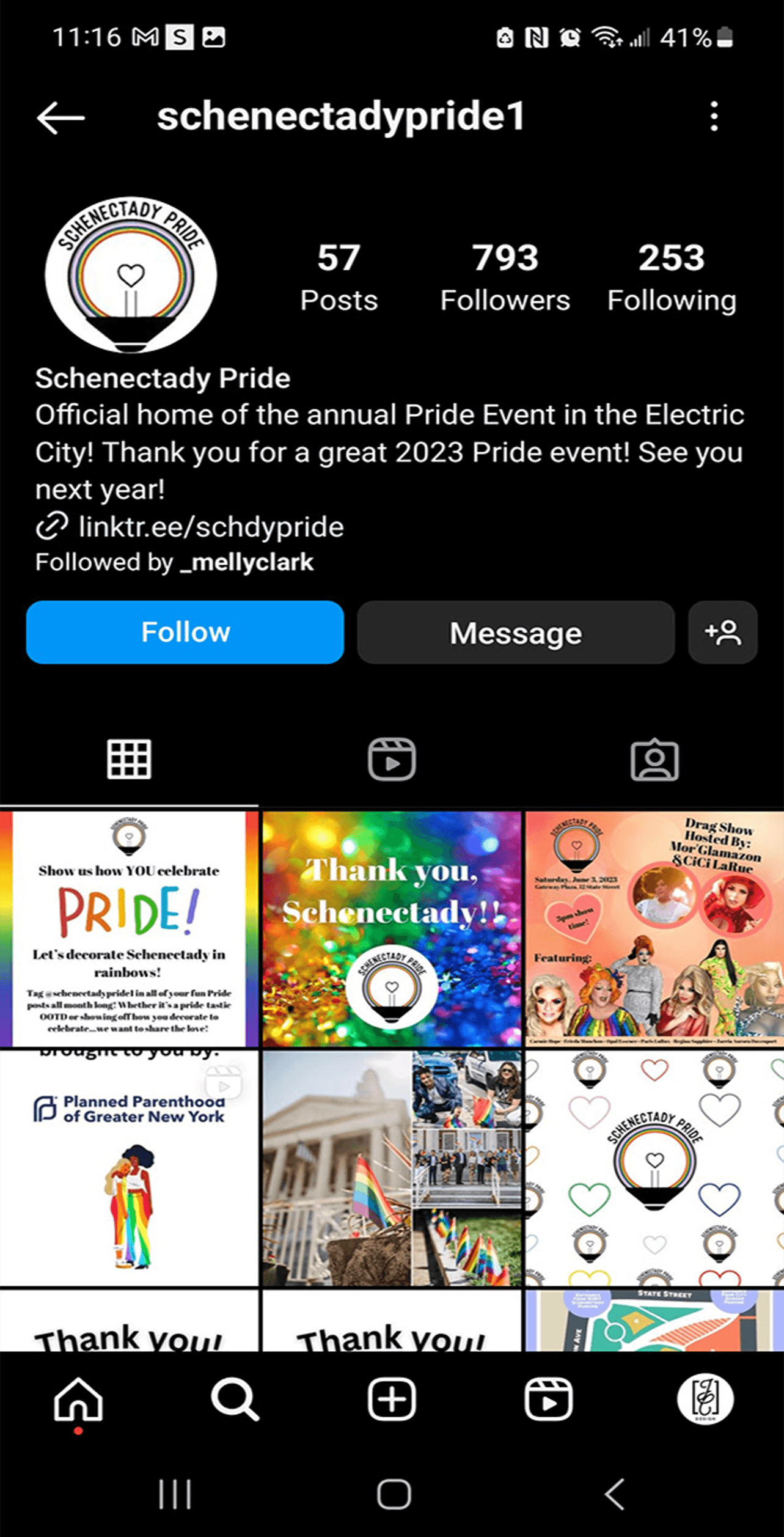
As an LGBTQ+ designer, this project held personal significance. I focused on understanding the organization's mission and translating those values into an authentic visual identity. The challenge was creating a logo that balanced meaningful symbolism with simplicity while remaining recognizable and timeless.
Through an iterative design process, I refined the concept into a clean and versatile identity that reflects both the spirit of Pride and the character of Schenectady. The final identity provides a flexible visual system that can be used across events, marketing materials, merchandise, and future community initiatives.
year
2022
role
Graphic Design
tools
Adobe Creative Cloud
category
Branding & Identity
.11th Festival
Description is visible only if you'll add the alt text to images
.see also