Simone Biles
Editorial magazine spreads focused on layout, typography, and visual storytelling
.magazine
problem
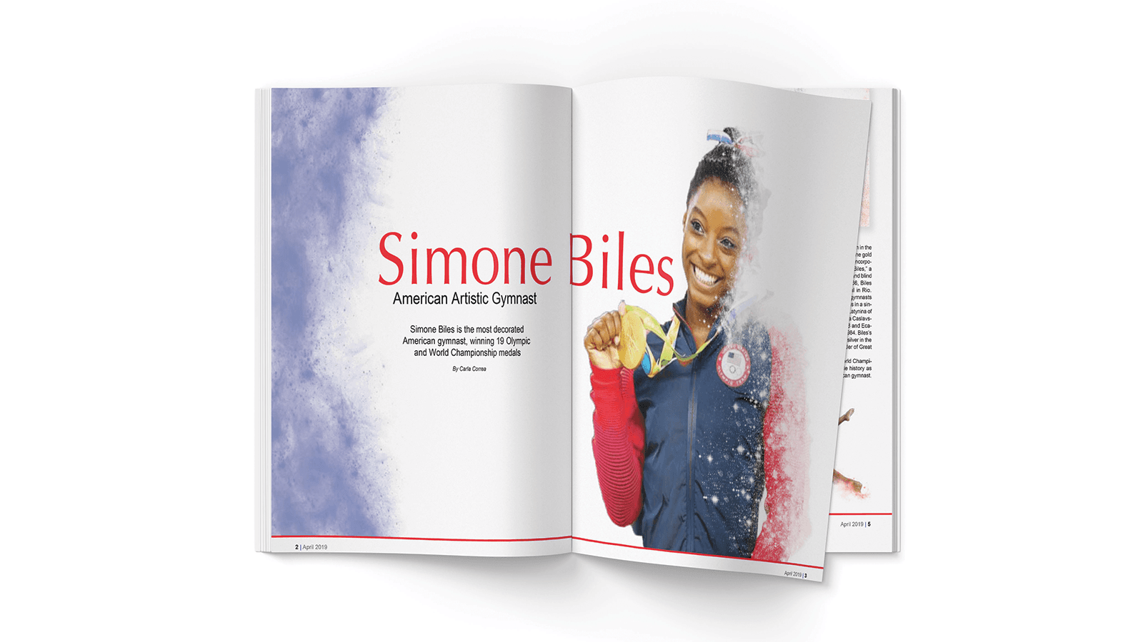
The challenge was to organize dense editorial content into a layout that feels engaging, readable, and visually balanced.
solution
I used strong typography, grid systems, and image placement to create structured, dynamic spreads that guide the reader.
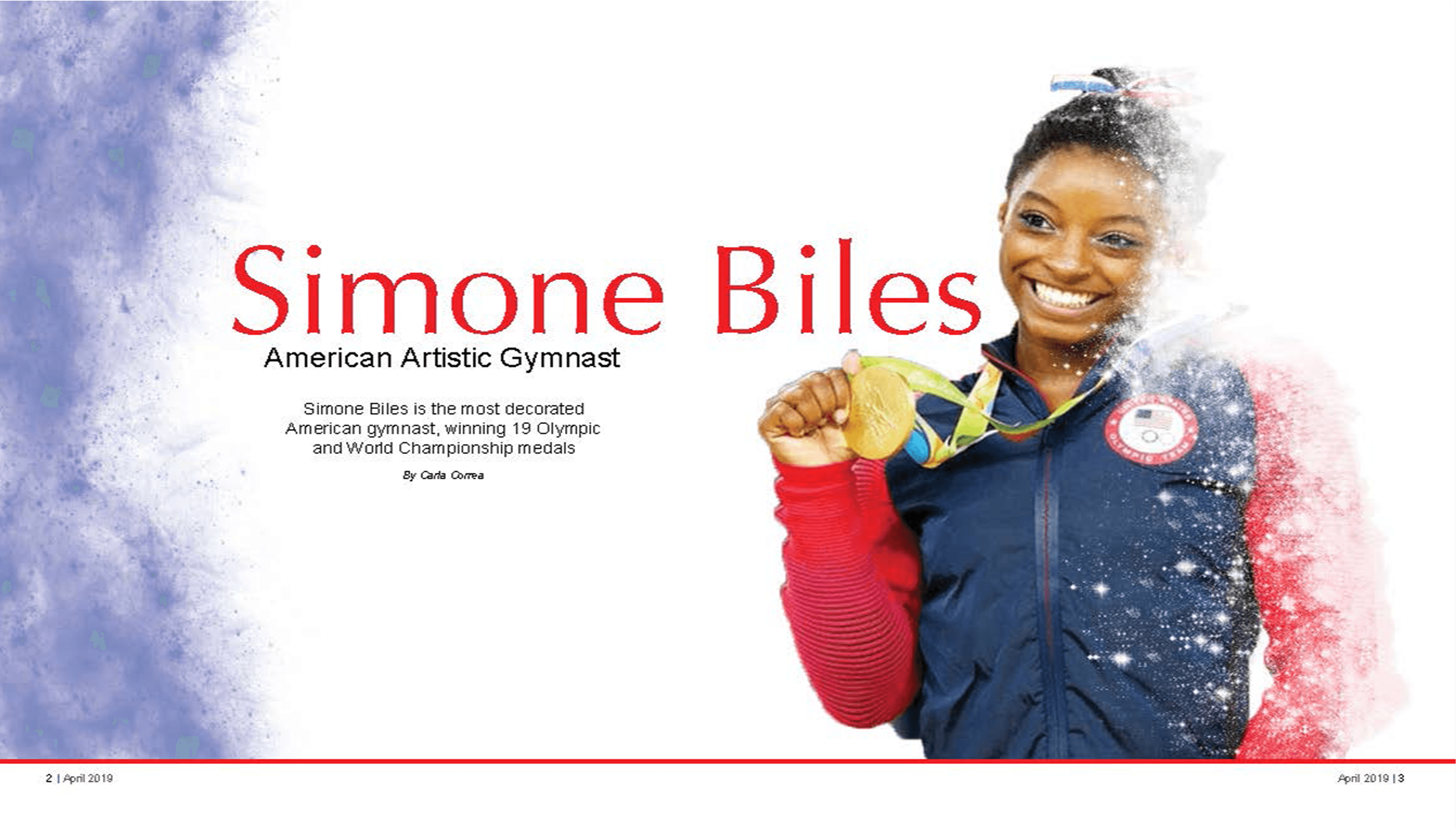
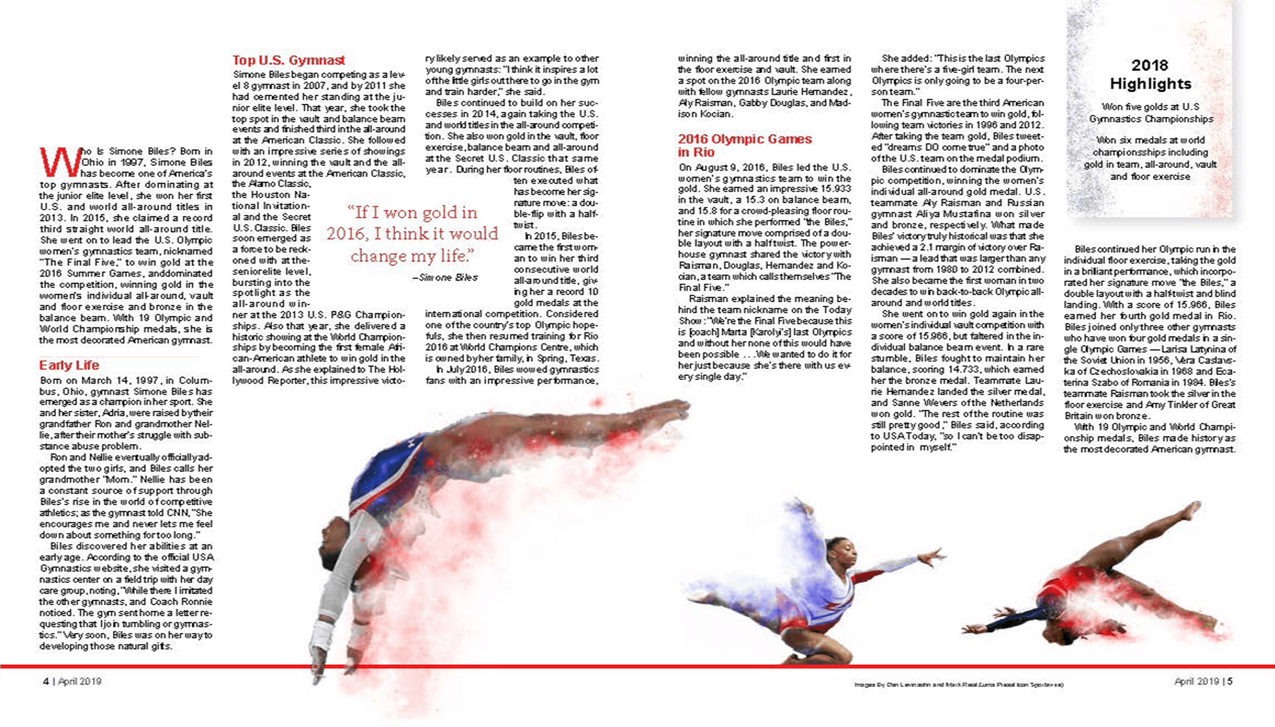
This project challenged me to communicate emotion through editorial design while maintaining readability. Careful attention was given to typography, spacing, and composition to create a balanced layout that supports the story without overwhelming the reader.
The final magazine spread combines expressive visuals with thoughtful typography to create an engaging reading experience. By balancing strong imagery with a structured editorial layout, the design highlights both the story's emotional impact and the importance of clear visual communication.
year
2024-2025
role
Edirorial Designer
tools
Adobe InDesign, Photoshop
category
Visual Design
.mockup
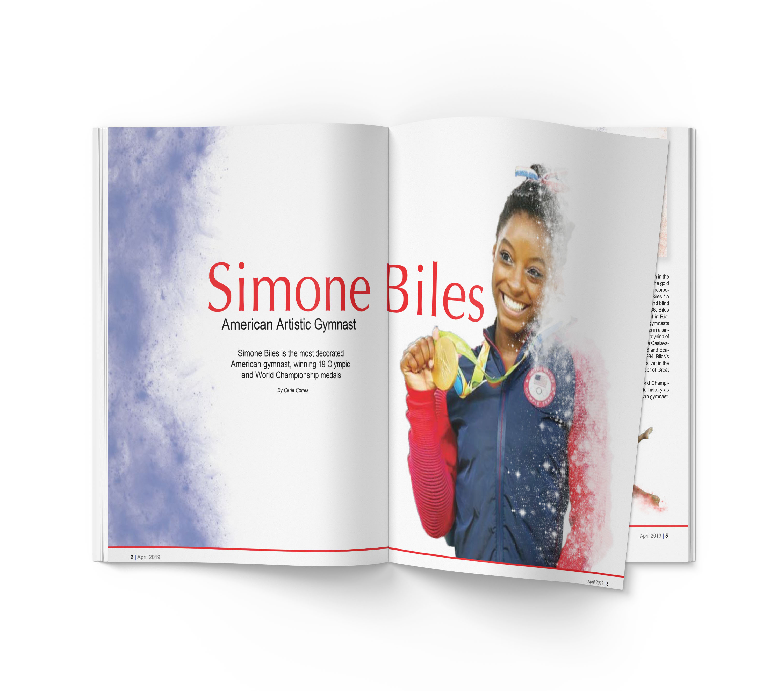
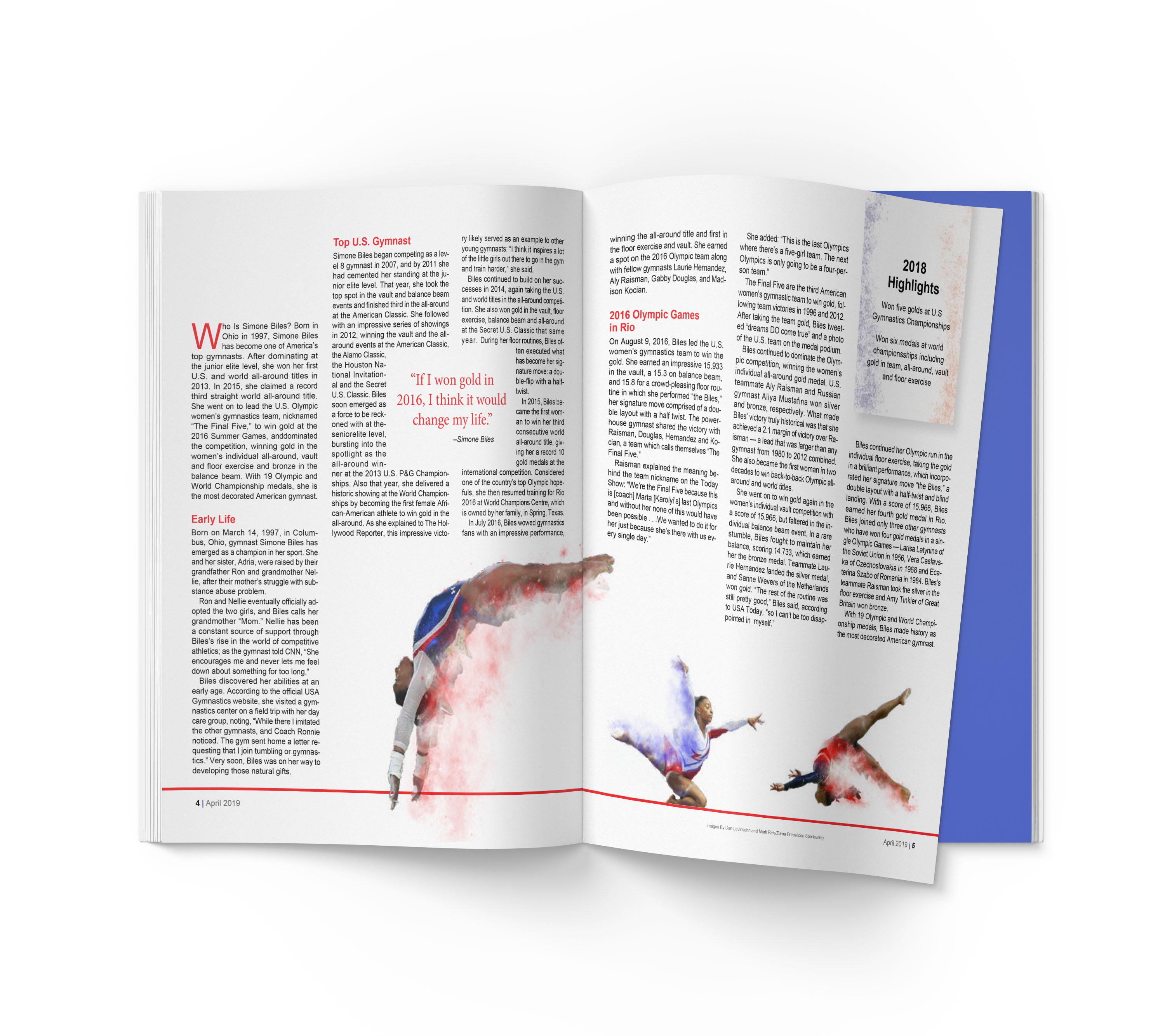
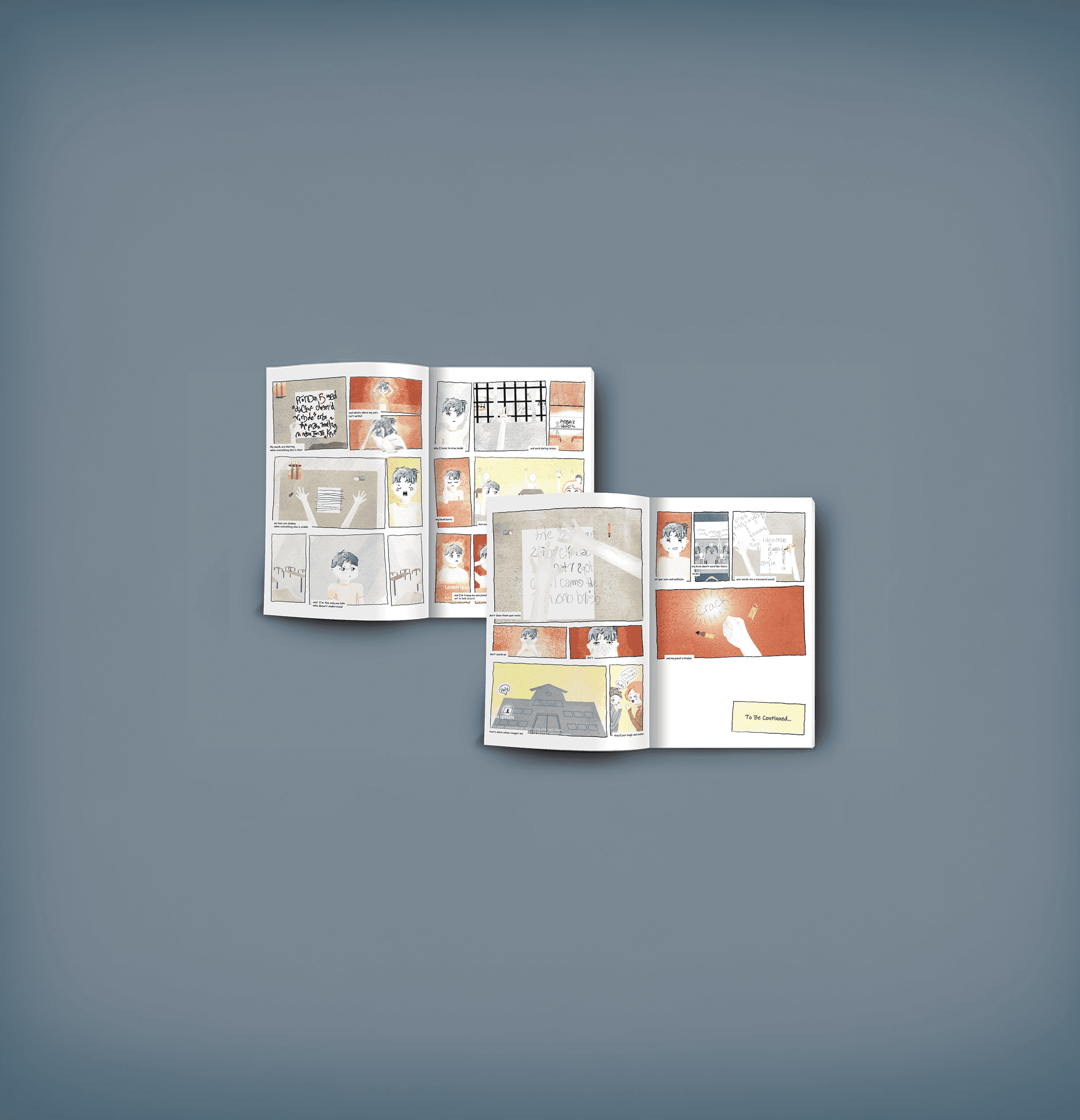
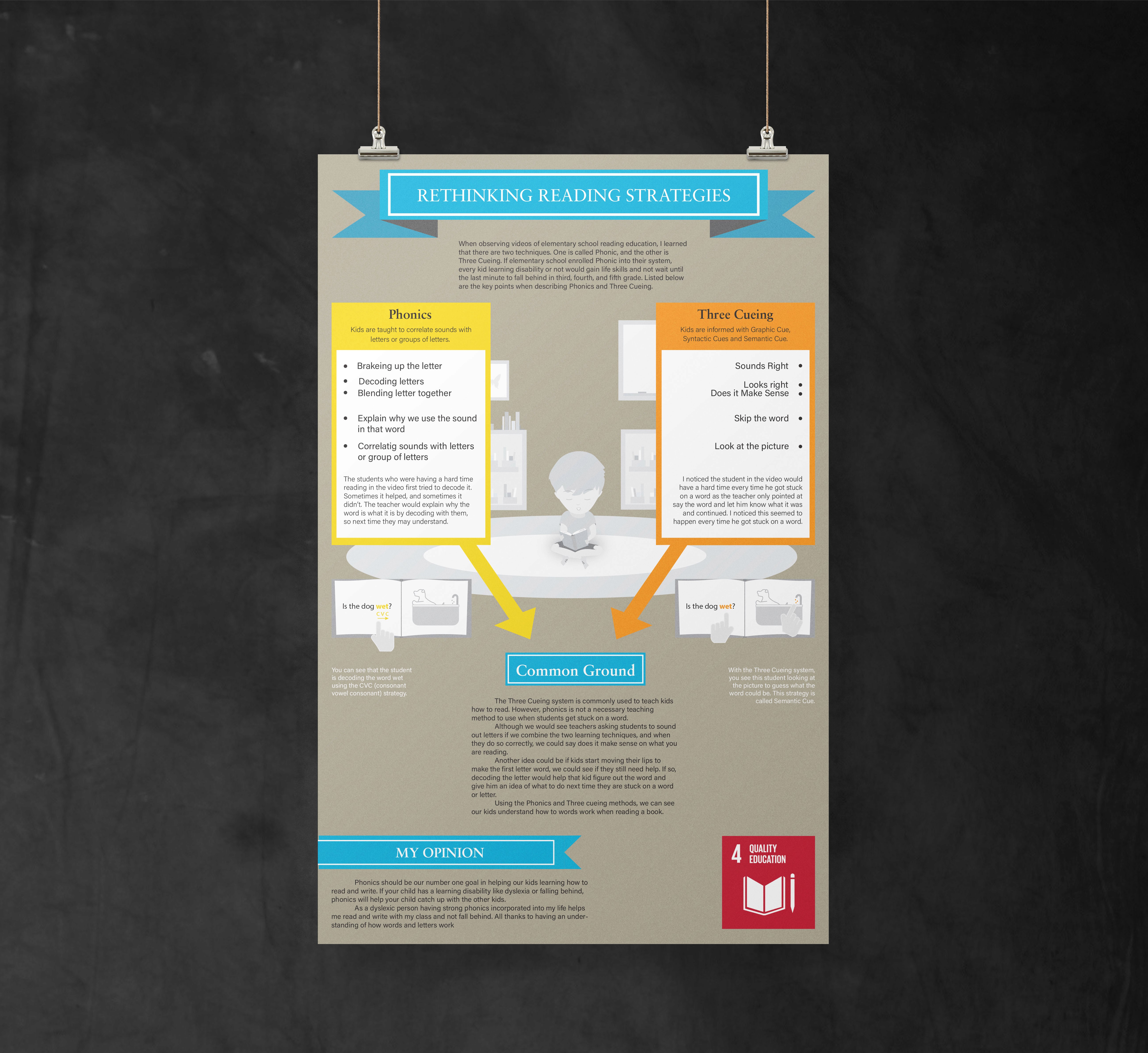
Magazine spreads combining dynamic imagery, typography, and structured layouts.
.see also