Title Sequence Reboot
Title Sequence Reboot is a motion design project focused on reimagining an existing title sequence through cinematic pacing, visual storytelling, and animated composition.
problem
Original title sequences can sometimes miss the opportunity to fully establish mood, tone, and visual identity before the story begins.
solution
I reimagined the title sequence through motion graphics, typography, pacing, and cinematic composition to create a stronger emotional introduction and a more immersive viewing experience.

Throughout the project, I explored how motion design can influence emotion and strengthen visual storytelling. The final title sequence establishes a tense, unsettling atmosphere that reflects the psychological tone of the film while demonstrating how motion design can communicate narrative before a single line of dialogue is spoken.
year
2021
role
Motion Designer
tools
Adobe Creative Cloud
category
Animation & Visual Effects
.video
Final Motion Piece
Watch the final title sequence to see how motion, typography, pacing, and digital-inspired visuals come together to reimagine the world of ReBoot.
.storyboarding & initial sketches
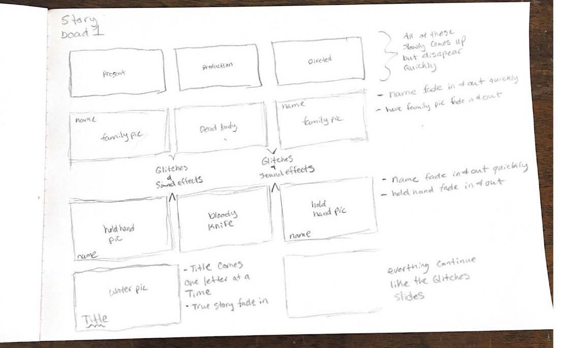
Early exploration of typographic distortion and layout experimentation.
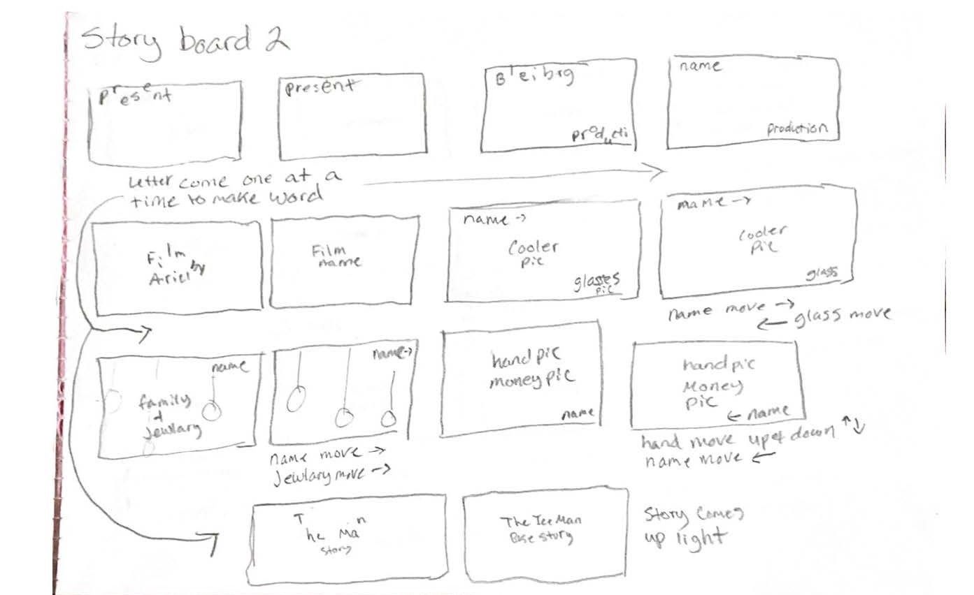
This process stage highlights the early storyboarding and sketch development used to plan the title sequence’s visual direction, pacing, and narrative tone.
.color & mood exploration
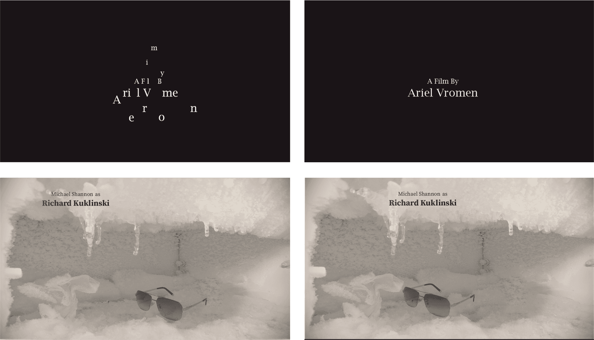
Early exploration of typographic distortion and layout experimentation.
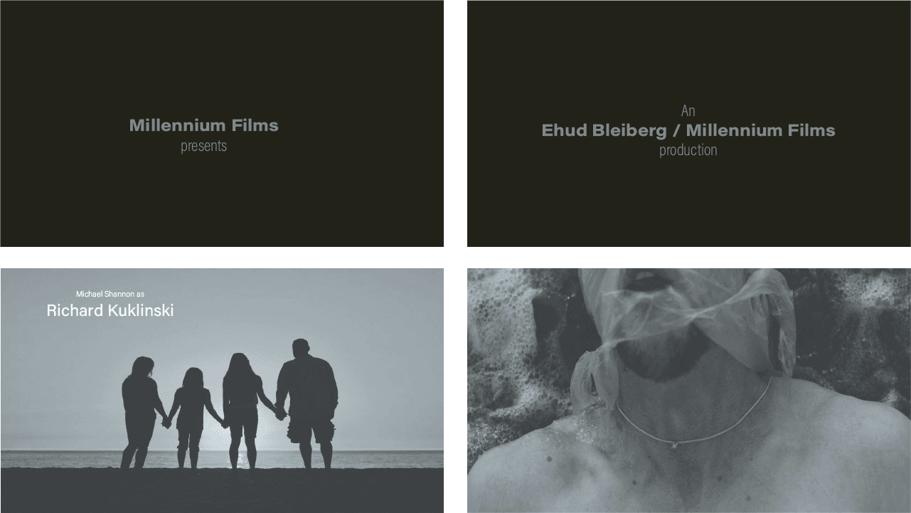
This process stage explores how color was used to establish mood, foreshadow tension, and support the cinematic tone of the title sequence.
.out come
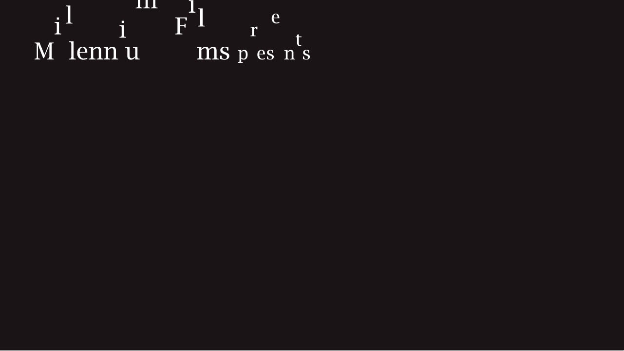
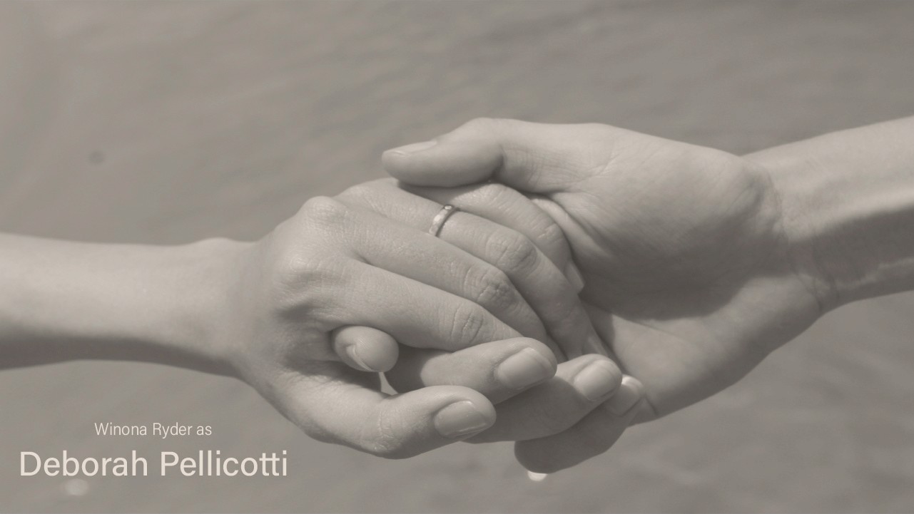
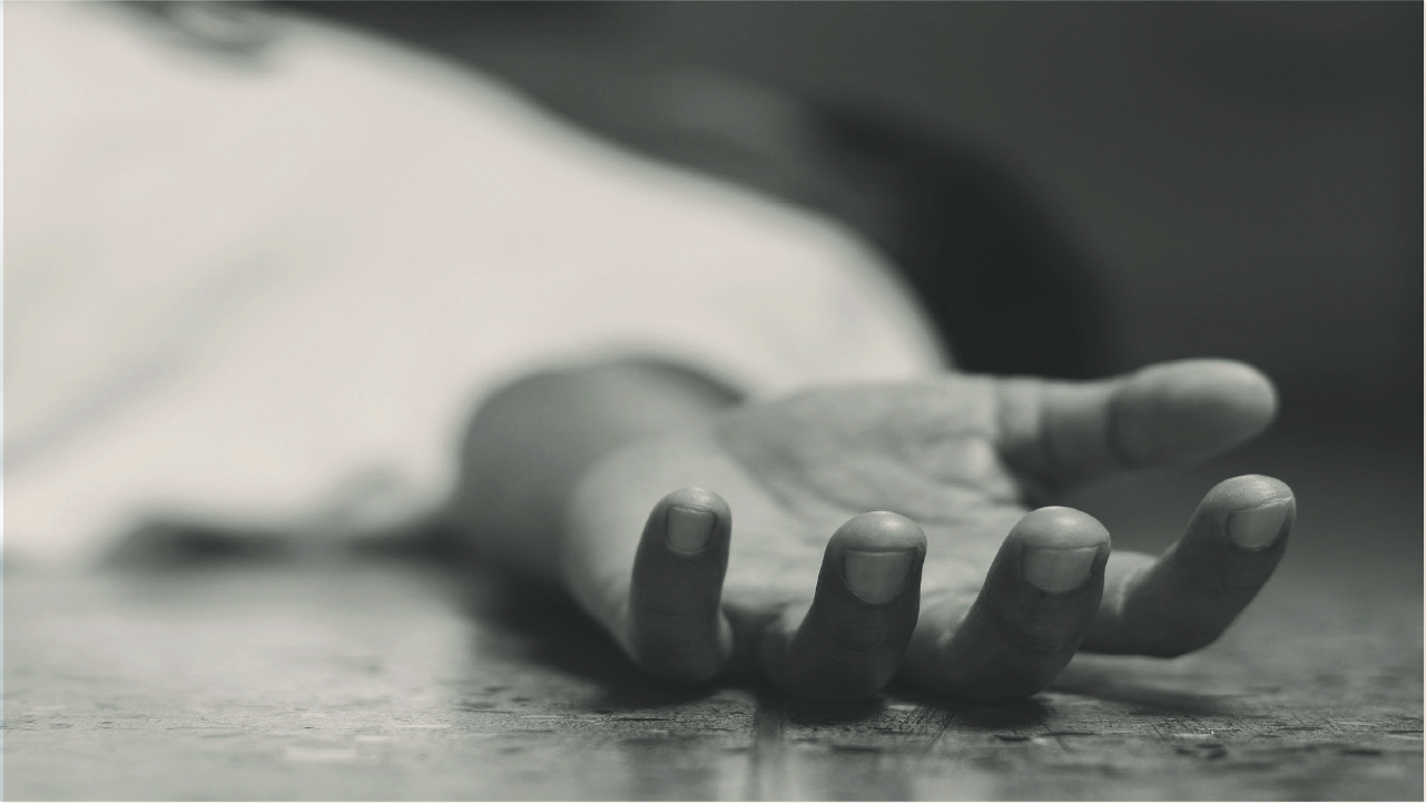

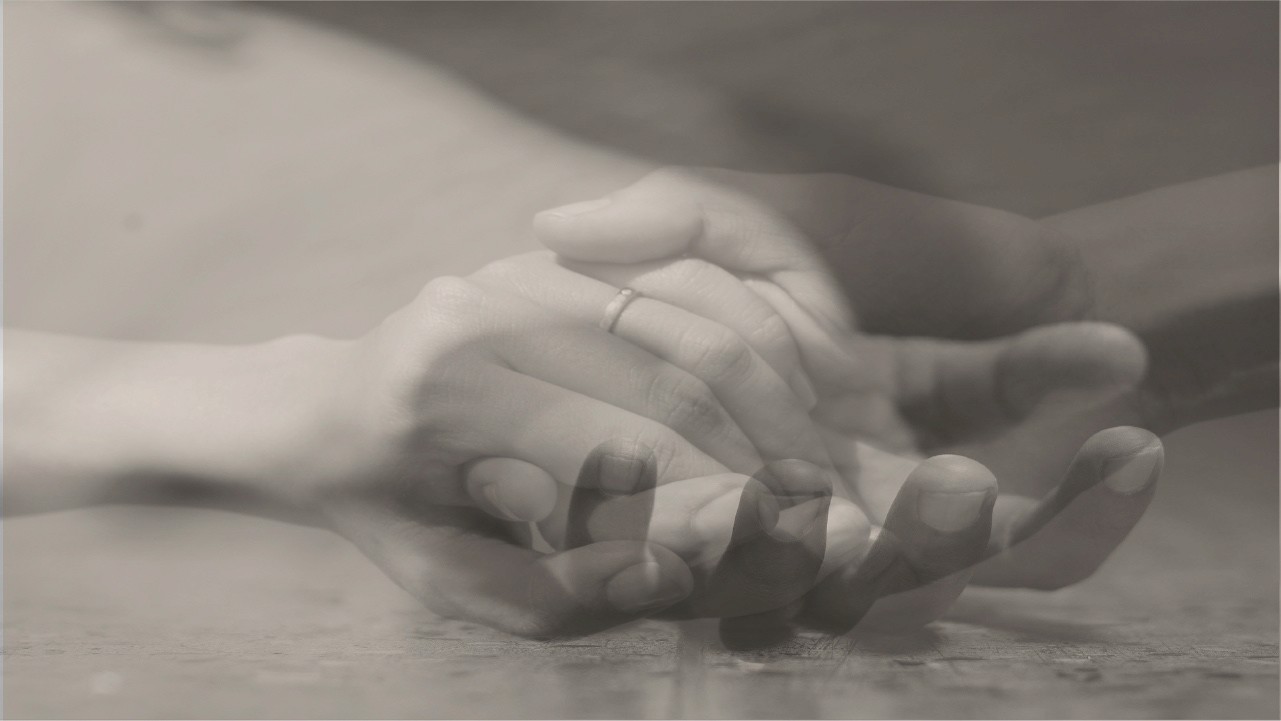
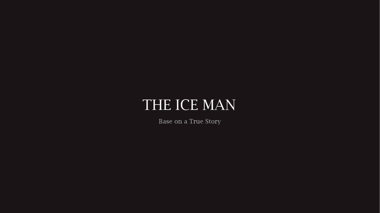
Using overlays and image adjustments in Adobe Photoshop, I developed a visual style that creates mystery and unease. Once the look was established, I focused on animation by designing the text to move slowly and assemble itself, reflecting the feeling of an investigation unfolding. This motion approach supports the story’s central theme of uncovering The Iceman’s true identity.
.see also