Kinetic Typography
Kinetic typography uses animated text to communicate meaning through movement, timing, and visual rhythm. This project explores Baskerville through motion, highlighting the typeface’s elegance, readability, and timeless character.
.kinetic typography
problem
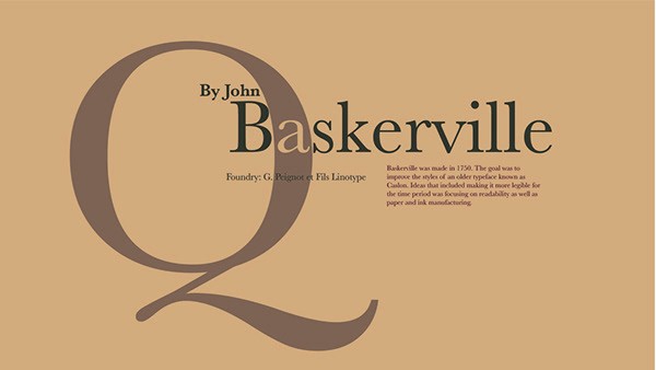
The challenge was to present Baskerville in a way that felt engaging and contemporary while still honoring its classic structure and historical character.
solution
I used motion, timing, scale, and pacing to bring Baskerville to life, turning the typeface into a dynamic visual experience that showcases its elegance and readability.
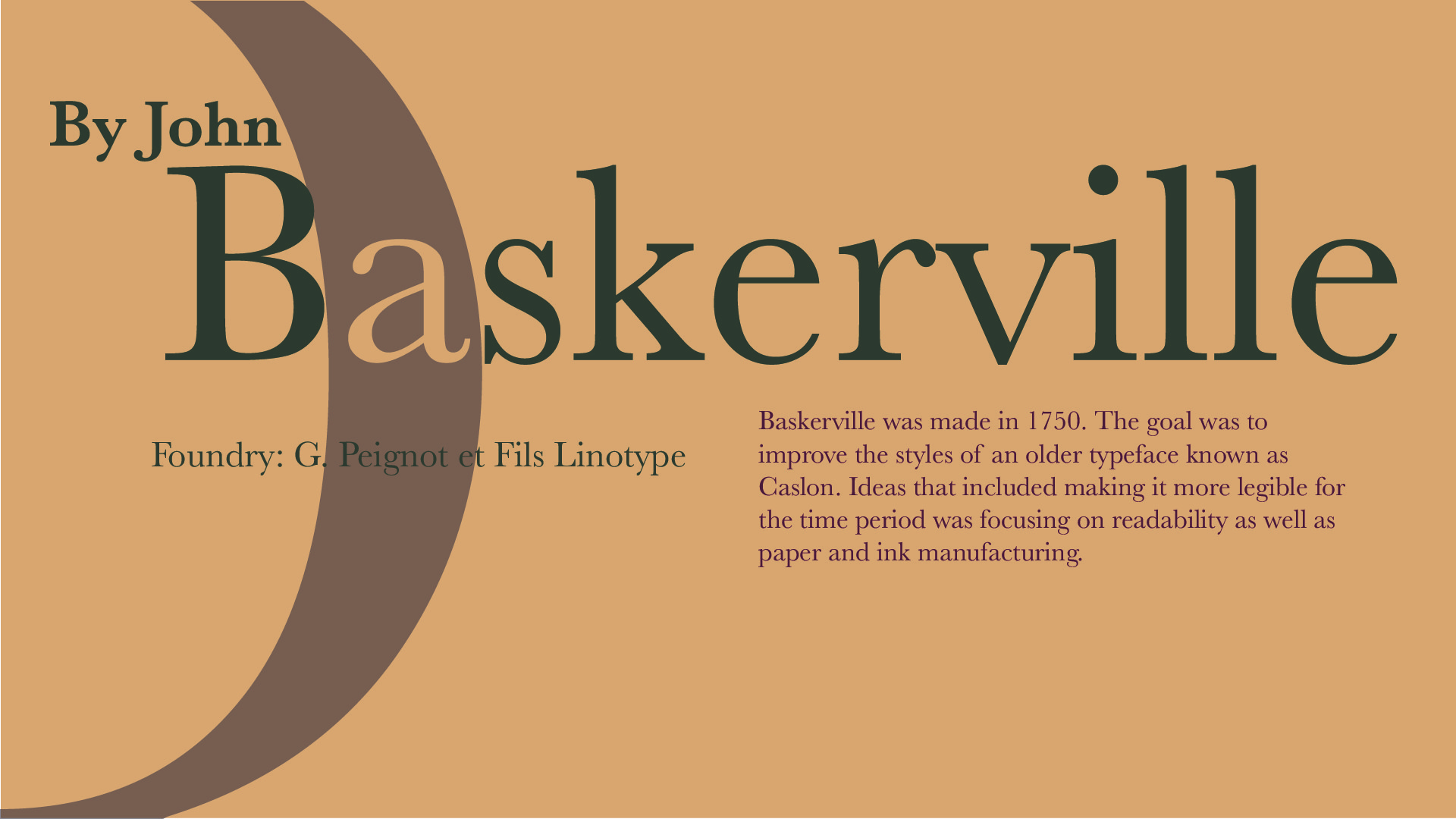
I chose Baskerville for its elegant letterforms, strong readability, and connection to traditional book design. To reinforce that aesthetic, I paired the animation with a warm, vintage-inspired color palette and music that complemented the typeface's timeless personality.
Through timing, scale, pacing, and movement, the final piece transforms Baskerville from a static typeface into a dynamic visual experience. The animation highlights its enduring character while demonstrating how typography can communicate history, tone, and emotion through motion.
year
2021
role
Motion designer
tools
Adobe Creative Cloud
category
Animation & Visual Effects
.video
Baskerville in Motion
Watch the final kinetic typography piece to see how Baskerville’s classic letterforms are brought to life through movement, pacing, and a warm vintage-inspired visual style. The animation highlights the typeface’s literary character while transforming it into a dynamic motion experience.
.storyboarding & initial Sketches
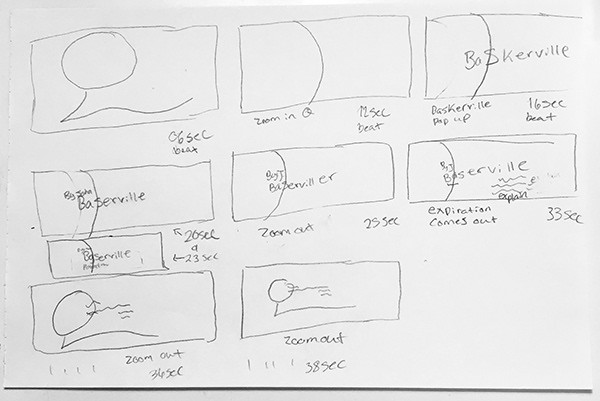
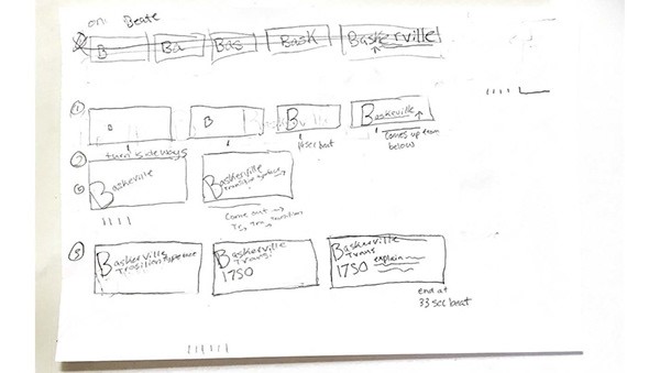
Early exploration of typographic distortion and layout experimentation.
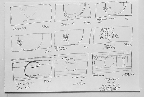
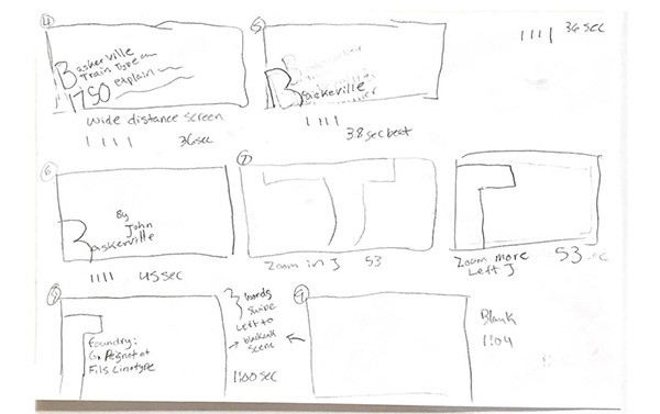
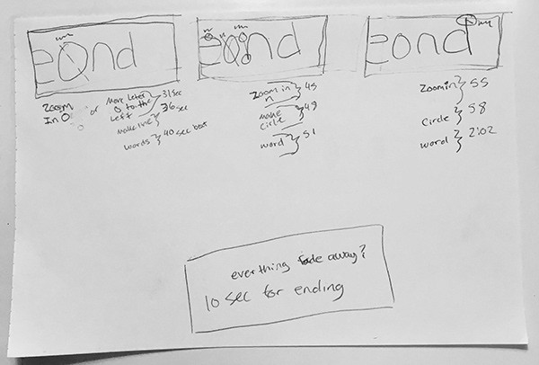
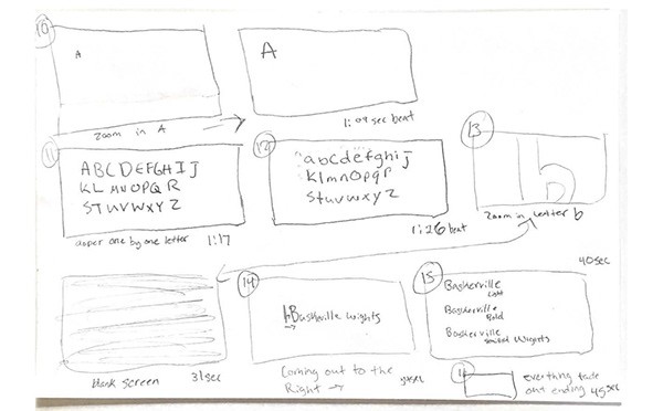
After selecting Baskerville, I researched its history, structure, and visual personality to better understand what makes the typeface feel timeless and refined. This research guided my early sketches and animation concepts, helping me make design choices that reflected Baskerville’s elegance, readability, and classic book-inspired aesthetic.
.color & aesthetic direction
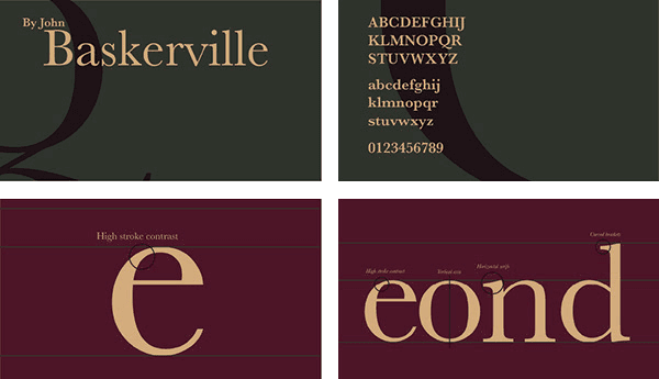
Early exploration of typographic distortion and layout experimentation.
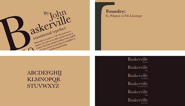
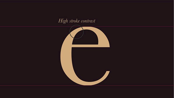
To create a dark academia aesthetic, I explored color palettes that matched Baskerville’s elegant and literary character. Because Baskerville is a transitional serif typeface with high contrast, sharp serifs, and a refined structure, I chose colors that supported its old book-inspired mood while keeping the animation visually cohesive and immersive.
.out come
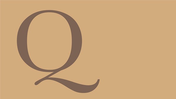
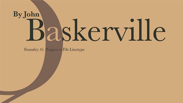
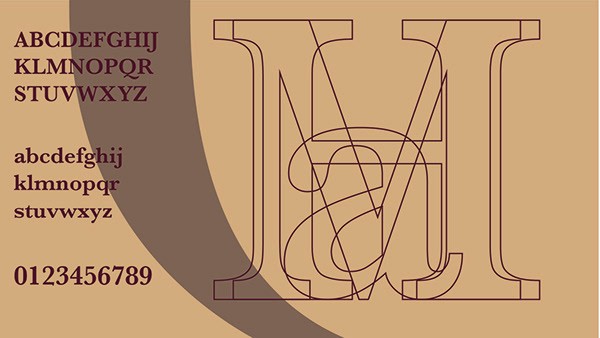
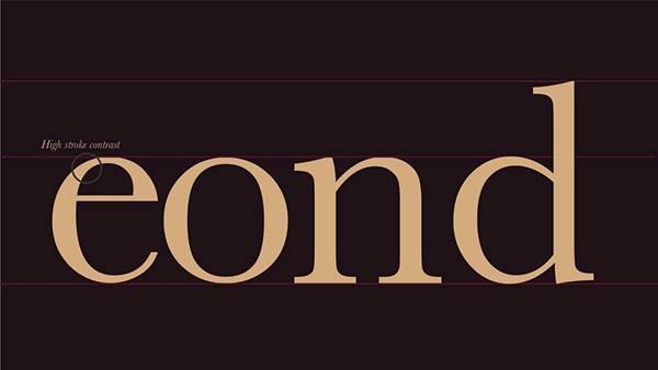
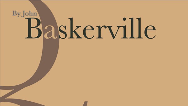
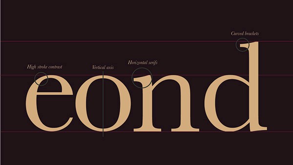
To document the final kinetic typography piece, I created a PDF storyboard featuring key moments from the animation. This visual breakdown shows how typography, motion, color, and pacing work together to highlight Baskerville’s character and create a cohesive animated type specimen.
.see also